

I kid. I wish.
Their task was to redesign four rooms in a large Bed-and-Breakfast, updating the space, yet maintaining that warm and cozy B-and-B at the shore vibe. They were broken up into teams, like this:
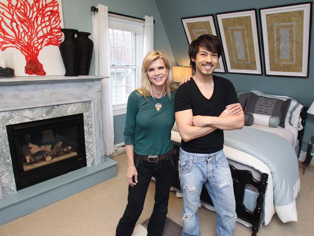
Cathy and Kevin

But Kevin was no better. Telling us he's never whitewashed a floor before, he decided to white wash a floor. And does so without even sanding the floors first, to maybe, oh, I don't know, take off that top coat of dirt and varnish so the whitewash can adhere to something. The paint had scarcely dried when the scuff marks showed up.
Cathy doesn't work with others, and even admitted as much, again to the judges, so why is she still there? She's bossy and arrogant and full of herself. She snapped at Kevin after she ordered him to call a store about a chair, and then tells us she has no words to describe what it was like working with him.
I bet he has a word for her!
Hits: Kevin's headboards he built to resemble the four-paneled doors.
Misses: Cathy's handyman moldings, which were hung too low, and didn't actually go all the way around the room.
Kellie and Bret

In Miami....not the Jersey Shore.
Kellie's big contribution was buying a yellow bird chair, which again makes me wonder: is design just buying stuff? Or is it creating stuff? Like the artwork Kellie created for the room that looks like Tuxedo rolled in paint and then took a long stretchy catnap on a piece of canvas. People always look at modern art and say 'My kid can do better than that' but in this case, my cat could have been more creative.
Bret, hoping to stay in the show, needed a big wow moment, and he found it by removing the padding from the old headboard, cutting the plywood into squares, nailing them to a wall and then painting them white. Cozy. Not.
Hits: That yellow chair, which leas me to believe the show should be calling Shopping Star.
Misses: Pathetic artwork and that horrifically uncomfortable headboard.
Leslie and Tyler
Tyler repaired a couple of wicker chairs, with new pads and fabric, then painted stripes on the back. It was cute, but not nearly as impressive as Vern Yip made it out to be.
It was a redone chair, Vern, not the second coming.
The room was nice, and the owner's liked it, but there was no wow, no excitement. No modern touches. It was just repainted, rebedded, redone. Kind of sad.
Hits: Leslie's art and Tyler's ooooooh chairs.
Misses:Tyler decided to faux the fireplace. Yes. Faux. Even he couldn't sell it.
Karl, Mark and Meg

They were teamed in three because they had the biggest space to design. Some gargantuan barnlike room with two big beds and a leather porn couch. There were lots of opportunities, but the three of them never came up with a plan or a concept or an idea. They just went shopping, and argued about blinds and lamps and working together.

But then, the aha moment came, when they entered the last store and found couches and knickknacks and....stuff. Suddenly they were all filled with ideas. And mutual respect and admiration for one another. Bluebirds sang.
Meg took one of the bedroom nooks and really worked it out. There was great color and great fabric, and it looked like a comfy cozy beachy inn.

She crammed every designer cliche into one sentence.
But at least it was design. Mark made a rope sculpture. He called it a ladder, but, honey, it was rope. Karl reverted to his need to paint and created a painted chair rail effect that mimicked the beach and sea and sky. It was cool, but Karl is just a painter. Oh, and a magician apparently, because he sawed a table in half and made it into two tables!~
Hits: Meg's nook, Mark's laddery-sculpture, and Karl's border.
Misses: The judges found none but I'd say Mark's laddery sculpture.
The Judging
Tiny Tot and the Schlockmeister were joined by Kathy Ireland, who was introduced as though she was the Design Star,m when she's just a former model who stamps her name on everything from sheets to glassware and is called a designer.
They made quick work of dispensing their verdict. The three men, Karl, Meg and Mark, won, with Meg getting top honors. Meg celebrated with some scotch, a cigar, and a hooker.
Leslie and Tyler get a save, as does Kellie and her artwork. Cathy The Shopper gets an other week of not doing what the show is about, which leaves us with Bert and Kevin--last week's winner--in the boot.
And Bret gets booted for his headboard, and for his lack of showing them who is is as a designer, like Cathy did with her shopping and Kellie did with her shopping.
Bert should'a gone shopping........

*Meg celebrated with some scotch, a cigar, and a hooker.*
ReplyDeleteSnorkle - you is soooo evils!
Glad I wasn't the only one who found the whole thing less than inspired.
You know every year I keep saying I'm never watching this again, but I'm back. Actually, I think this years pack might be better than last year's, but that's a pretty low benchmark.
ReplyDeleteI thought all the rooms were dull with odd proportions, like Meg's dresser shoved in next tot he bed where you would never be able to open the drawers.
Did you notice that the owners didn't seem very excited about any of the rooms? I'm sure they were adding up what it will cost them to repair the rooms back to 70's ugly they used to be the proud owners of.
ReplyDelete